Sunday, January 14, 2024
By Scott Lorenz
Westwind CommunicationsYour author website is a critical element for the promotion of your books. It’s where people turn to learn more about who you are and what you have to offer. Therefore, it’s important your website provides visitors what they are looking for… information about YOU, YOUR book and how to buy it. Don’t make people click on ten links to get to the buy button!
Key elements of an effective author website include:
- Book Cover
- Author Headshot
- Blurbs from Reviewers
- Book Trailer
- Buy Buttons to Amazon, Barnes and Noble, etc.
- Excerpts or Quotes from the book
- Media Clips & Logos
- Book Awards
- Your Backlist of Books
- Option to sign up for your mailing list
If you’d like to create an attractive website that builds your brand and promotes your books, it’s a good idea to explore current author sites and ‘benchmark’ against them. Why reinvent the wheel right? They can give you some inspiration and help you take the right steps toward the ideal online presence. Here’s a list I’ve compiled of the ‘Top 25’ author sites for your review. Let me know what you think. If you know of an author website to add to the list tell me in the comments section below.

James Patterson can afford to pay just about anything for his web design so what exactly is he doing? Take a look and find out for yourself. Fortunately, he has a mailing list you’re welcome to join. You can also tweet out all his books and check out his latest trailers.

When it comes to color, Anthony Horowitz nailed it. He was strategic about the colors he used. As you can see, the rustic orange highlights his top-selling books. Horowitz also displayed his Twitter handle prominently so you can follow him easily.
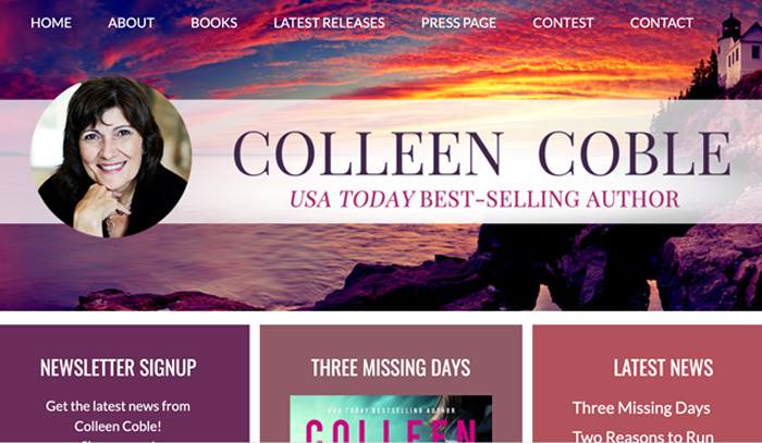
You can’t go wrong with a website layout like the one on Colleen Coble’s site. It boasts a clean look with features like a newsletter signup as well as designated pages for her current lineup of books, latest releases, and media coverage.
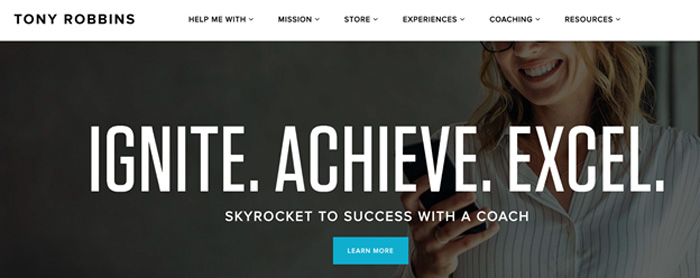
Tony Robbins’ website is catchy and compelling thanks to the emphasis on his tagline. From the moment you visit it, you want to “Ignite. Achieve. Excel.” His website makes it clear that his coaching services have the potential to change your life.

Jay Shetty’s website promotes his offerings which include his podcast and courses. It also highlights his impressive media coverage. Once you visit his website, you’ll know right away that he was featured on The Today Show, Red Table Talk, World Mental Health Day, and many others.
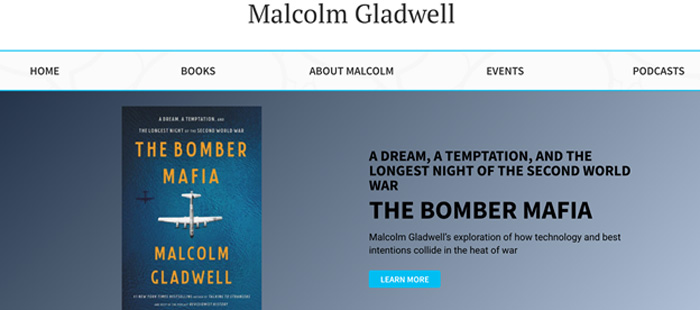
Malcolm Gladwell has a clean website that draws attention to one of his top books, “The Bomber Mafia.” The “Learn More” tab directs site visitors to take the next step and buy the book on places like Amazon and Apple Books.

In addition to the attractive design, Stephen King’s website features an informative frequently asked questions page (FAQ). Visitors can go there to find out why he became a writer, where he gets his ideas, and more.

When you go to Emma Davies’ website, you’re sure to notice the turquoise color scheme as it really stands out. There’s also a great picture of her as well as a welcome message that directs visitors to her social media outlets and contact page.

Daniel Gibbs knew what he was doing when he requested an interactive website. Visitors can enjoy a variety of unique pages like the map page, ship schematics page, timeline page, and robust universe encyclopedia.

There’s no denying that the close up of Jonathan Fields’ face catches your attention. His website also features a one-of-a-kind email signup that you’ll be directed to join if you state that you “totally agree” and love discovering stories and ideas that inspire you.
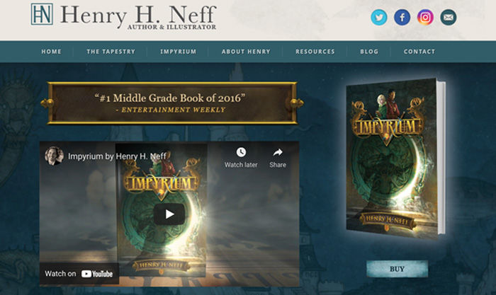
Henry Neff’s social media profiles stand out and draw visitors to become a follower or fan. Additionally, his website boasts a robust “About Henry” section with his biography, events, press and interviews, and school visits.
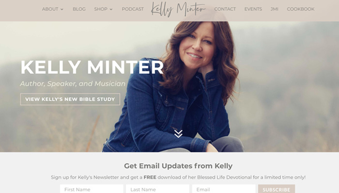
Kelly Minter’s website has a lovely picture of her and clearly conveys who she is: an author, speaker, and musician. We love the easy access to her bible study and email signup that lures visitors in with a free download.

Timothy Keller’s website is focused on one of his famous quotes and directs visitors to his bio. The top navigation is simple and only features four links: bio, books, sermons, and blog. His black, white, and red color scheme is also easy on the eyes.

Karen Kingsbury’s website is designed to get visitors to buy her New York Times bestselling book, A Distant Shore. Once you visit it, it becomes quite clear that she wants you to order it as soon as possible.
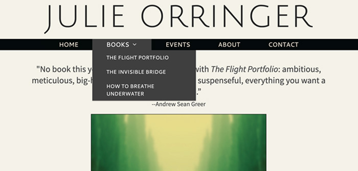
Julie Orringer’s website has dedicated pages on each of her books, which revolve around the experience of Jewish characters during World War II and current times. Each page includes a description of the book, reviews, and links that direct visitors to make a purchase.

Nicole Krauss’ website is unique in that the navigation is on the left rather than top of the home page. It also features pages that focus on each of her books about Jewish history, themes of identity, and family connections.

My wife loves Janet Evanovich and has read all of her books. On Janet’s website, her book “Game On” steals the show. The dark background really allows it to stand out. We also love the social media icons on the top left and subscribe button on the top right.
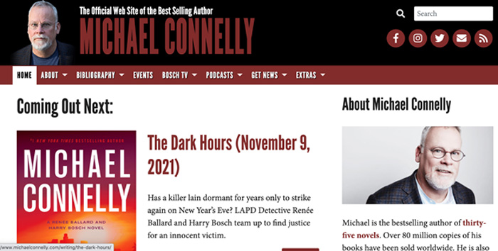
Michael Connelly’s website features a compelling about section that does a great job highlighting his key accomplishments. There’s also a space that gets visitors excited for his upcoming releases and dedicated pages for events he’ll be attending and podcasts he’s participated in.
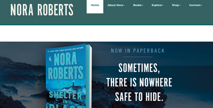
Nora Roberts’ website has a rotating banner that draws attention to the various books she’s written. The books section is quite robust as it includes a release schedule, details on every book she’s written, and a printable full book list.
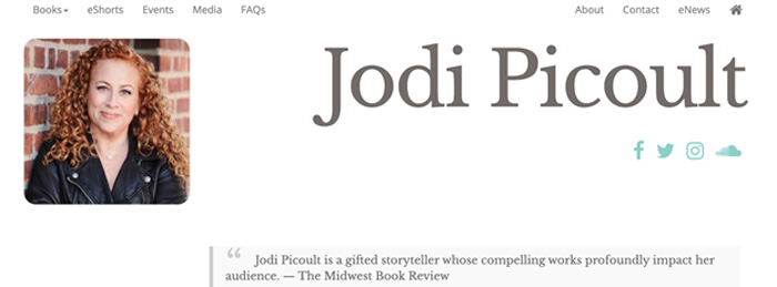
Jodi Picoult’s website is simple yet compelling. The white background makes the teal social media icons and lovely picture of her stand out. Her site also includes unique pages for all her books, each featuring a synopsis and video.
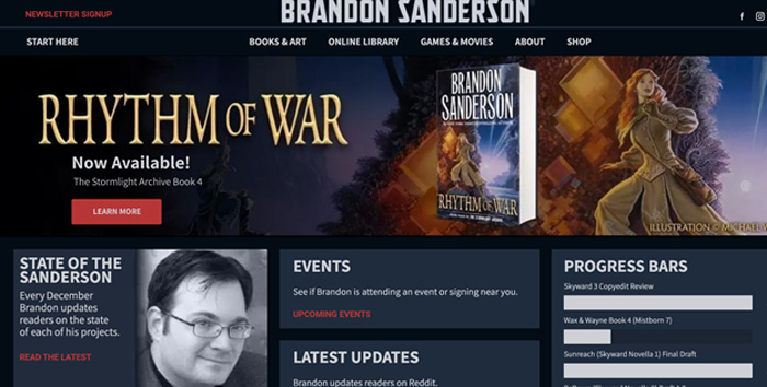
Brandon Sanderson’s website focuses on his latest book and gives visitors a status update on his projects. In addition, there’s a regularly updated blog and online library with sample chapters, free fiction, and annotations.
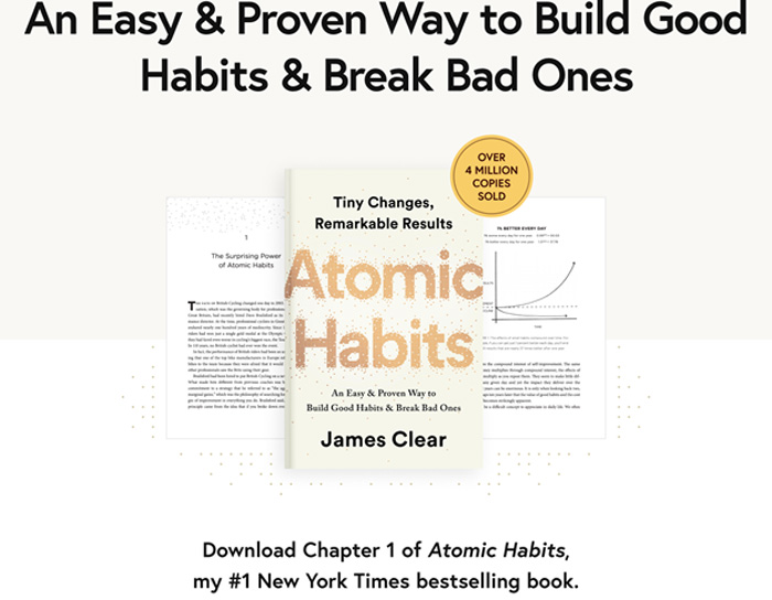
James Clear’s website is all about his top book, Atomic Habits. It allows visitors to download the first chapter for free in the hopes of luring them in to purchase a copy and keep reading. Visitors can also subscribe to his weekly newsletter.

JK Rowling’s website revolves around her new children’s book, The Christmas Pig, visitors will find her signature at the very top as well as a great picture of her. There’s also an ‘Answers’ page where JK Rowling answers common questions about herself.

Gary Vaynerchuk’s website is a simple black and white color scheme. The large text about his book, Crushing It really stands out. His website also includes a link to learn more about VeeFriends, his collection of non-fungible tokens (NFTs).
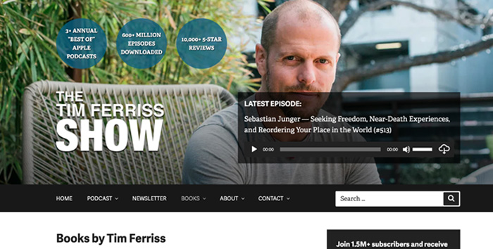
Tim Ferriss’ website was definitely created with a lot of thought and strategy. He owns the phrase ‘FOUR HOUR’ as he is the author of The Four Hour Workweek, The Four Hour Chef and others with Four Hour in the title. There’s a great picture of him outside and an embedded recording of the latest episode of his show. The search box and teal callouts that showcase his greatness are other great additions. But, content is king and there’s plenty of it on his website/blog.
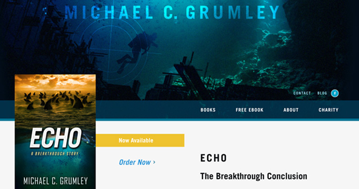
Michael Grumley’s website has a “Next Book Meter” to show visitors how far he is into his next book. It also treats them with a free ebook and shares information about how they can support St. Jude’s Research Hospital by buying his books.
The Bottom Line: When you design your author website, there’s no need to reinvent the wheel. Take a look at other author websites to get an idea of what you like and what type of layout and features would work best for your particular goals.
Book publicist Scott Lorenz is President of Westwind Communications, a public relations and marketing firm that has a special knack for working with authors to help them get all the publicity they deserve and more. Lorenz works with bestselling authors and self-published authors promoting all types of books, whether it’s their first book or their 15th book. He’s handled publicity for books by CEOs, CIA Officers, Navy SEALS, Homemakers, Fitness Gurus, Doctors, Lawyers and Adventurers. His clients have been featured by Good Morning America, FOX & Friends, CNN, ABC News, New York Times, Nightline, TIME, PBS, LA Times, USA Today, Washington Post, Woman’s World, & Howard Stern to name a few.
Learn more about Westwind Communications’
book marketing approach at
https://www.WestwindBookMarketing.com or contact Lorenz at scottlorenz@westwindcos.com or 734-667-2090 or fill out the form below. Follow Lorenz on Twitter
@aBookPublicist. Want help titling a book? Check out Scott Lorenz’s new award winning, bestselling book:
Book Title Generator- A Proven System in Naming Your Book www.BookTitleGenerator.net.Would you like help promoting your book?
If so, tell us a little about your book. What is the title? Do you have a publisher? What is the publish date? How many pages is your book? What is the cost? Do you have web site? What is your specific goal I.E., to make money, raise awareness, get the attention of an agent or publisher, sell the story to a movie or TV studio or something else?
Submit the form below with this information and we’ll get back to you as soon as possible. Thank you!
The post Top 27 Author Websites in 2024 Compiled by Book Publicist Scott Lorenz appeared first on The Book Publicist.